Thursday, 19 June 2014

Film Cover Analysis


What messages, meaning or emotions are the designers communicating through the choice and style of typography?

 
The poster has the Iranian flag on it and the movie is based on the difficult relationship between Iran and USA. The story is on spying; about an American hostage who shouldn’t have been in Iran in the first place.

The Iranian flag is covering Ben Affleck’s eyes which suggests a mystery, relates to spying and how he does not want to reveal his true identity. The typography of the title of the movie is big and bold. The caption “The movie was fake. The mission was real” is a strong caption which could suggest that the movie is based on a true story. The black and white colours which are the main colours of the poster could represent a ‘WANTED’ poster.

The first thing that caught my attention were the shredded strips of paper which could indicate a secret or hidden evidence that is about to be uncovered. The reason it could have been shredded in the first place implies that someone was trying to hide something. Also, it could suggest shredded documents or confidential documents. On the contrary, it could suggest a story that needs to be put together. In addition, there is one strip of paper missing as seen on the poster which also suggests hidden truth or a missing piece to the puzzle. It could also suggest that the truth is beneath all these pieces of cut up paper.

Furthermore, the bottom of the poster is in red because ‘The Town’ was a successful movie. Hence, this is suggesting the same outcome for this movie. Emphasis is added through the use of a bold colour and using a good successful director which promotes the movie. Also, red on a black background draws immediate attention to the eye. 

Michael Roberts


Michael Roberts was born in 1948 and is a British Fashion Journalist, Illustrator and Photographer. He studied Graphic Design and Fine Art before moving into fashion and he now lives in New York City, USA. And is the fashion and style director of Vanity Fair Magazine. He has already worked as a fashion director in many other magazines such as the New Yorker and the British Vogue. Also, he has made several illustrations for many Vogue magazines and additionally, he has books published of photography and illustrations.


 Robert’s illustrations are created using coloured paper/card and put together to create a collage. This generally illustrates the African culture and influences. With his choice of warm yet bold colours, grass, leaves and animal patterns, he makes references to the African landscape. He does not use too much detail, simply basic shapes to give the models, clothes and accessories a good structure and form. He also includes some 3D effect, such as the grass coming forward or the handbag larger than the model supposedly carrying it. This is to create the illusion that the work is not completely flat even though all he has used is coloured paper/card.

Julie Verhoeven

Julie Verhoeven is a London based Artist, Designer, Illustrator and Creative Director. She was born in Kent, England in 1969 and studied at Central St. Martins Fashion College in London. Verhoeven is most famous for her fashion illustrations; however she also produces sculptures and paintings. Initially, she started out as an assistant to John Galliano and later on designed for major designers such as Mulberry, Louis Vuitton and Versace. Also, her work has been exhibited at the Hayward Gallery and Rifle maker.

The very first thing that I noticed about Verhoeven’s work was that her work is incredibly abstract in the sense that she mainly uses a lot of her imagery, which in my opinion creates almost characters of a story. She selects sections that she will give more attention to detail to than other sections. For example, in the image above, the face and the accessories (such as the belt) has a lot more detail involved whereas the rest is left blank with a thin outline. She also adds a few extra elements to give it that very edgy, imaginative, abstract look to it, such as the fire, the circles, the umbrella and the water. I would say Verhoeven is one of my favourite artists of all time as she doesn’t go for a ‘perfect’ look, making her work different, unique and immediately eye catching.

Invention of the Printing Press & Moveable Type


In the mid-15th Century, the German goldsmith Johannes Gutenberg invented the Printing Press and the Moveable Type in Mainz, Germany. The Printing Press was invented with modifications, and increased mechanisation continued to remain the principal means of printing until the late 20th century. This invention also started a revolution in freedom of speech. In addition, it enhanced the democratisation of knowledge, destabilised the power of political and religious establishments, improved education, and placed the foundation for the modern knowledge-based economy.

Gutenburg had several methods of printing from moveable type, including oil based inks, special press and  metal molds allowed for the mass production of printed books for the first time. A Printing Press is a machine that transfers lettering or images with the use of different forms of inked surfaces onto paper or similar material fed into it; it is used for printing many copies of a text onto paper.
The world’s first known moveable type system for printing was created in China around 1040. Moveable type is a system of printing and typography that uses moveable components to reproduce the elements of a document. The pieces of this device are designed and then cut out into metal pieces to be used in the printing press machine. In this way, the printing text could have designed letters (typefaces). 

History and Development of Western Alphabet

The original alphabet was developed by the Semitic people living in or near Egypt. They based it on the idea developed by the Egyptians, but used their own specific symbols.  It was quickly adopted by their neighbours and relatives to the east and north, the Canaanites, the Hebrews, and the Phoenicians.  The Phoenicians spread their alphabet to other people of the Near East and Asia Minor, as well as to the Arabs, the Greeks, and the Etruscans, and as far west as present day Spain.

The Sumerians introduced experimenting with writing over 4000 years B. C which is known as Cuneiform. The early cuneiform compromised some 1,500 pictograms. For example, the word for bird existed at first as a simple symbol representation of a bird. The oldest pictograph on a limestone table has been dated at around 3500 years B.C.


The Egyptians developed a system of pictograms. Hieroglyphic inscriptions (sacred carvings) began as pictograms, but later those pictures were used to represent speech sounds. 

Phoenician Alphabet Origin

Egyption Alphabet Origin


Agnes Decourchelle

Artist’s Career
Agnes Decourchelle is a French free-lance illustrator. She graduated from Ecole Nationale Supérieure des Arts Décoratifs in Paris in 2001, and the Royal College of Art in London in 2003. She decided to become a Free Lance Illustrator in 2002 as well as a drawing teacher in 2010. Also, she has worked for magazines and trends publicity such as Marks & Spencer. Decourchelle mainly creates illustrations of people by using different colours in different tones (not black) which give her illustrations a soft and warm atmosphere to it.

Links With Own Work
For my Fashion Illustration project I have studied Agnes Decourchelle and have done similar illustrations that use the same style as her work. Her work is directly drawn with watercolours or colour pencils without any prior drawings. The colours in her illustrations are blended together using a dégradé effect. I like her work because it’s diverse and increases your originality of colour experimenting.
 

In my opinion, this illustration portrays a family gathering due to the expressions on their faces as well as the majority of the warm use of colours as well as the specifically chosen warm colours blended well together using watercolours. As well as that, this illustration does have a combination of warm and cold colours with only a small sector of the illustration (the drinks) being cold colours to depict the season of Summer. Through observation, I can infer that Decourchelle’s work is really detailed, sketchy and bright and well put together by blending the colours. 


 I like this image due to its simplicity of the face of a lady; just by adding a few warm tones on her face makes the image very eye catching. I believe here she has used colour pencils as the consistencies of the colours are thicker than the water colour illustration on the left.  She has used a variety of shades, and highlights certain areas (especially the right) to draw attention to the features of the face Half of the illustration involves warm colours and the other half uses cold colours depending on the reflection of light.


I like Agnes Decourchelle’s work because she has the ability to make even the simplest aspect of an environment become very eye catching by just using water colours or colour pencils; also, she directly sketches out the illustration and produces a detailed yet sketchy looking illustration. This is what instantly attracted me to her work.  

Tuesday, 25 March 2014

Picasso


Pablo Picasso is probably the most important figure of 20th century, in term of art, and art movements that occurred over this period. Pablo Picasso was born in Magala, Span, in 1881, and had created a mass collection of works during the extensive course of his career. In fact, by the time he died in France, in 1973, over 22,000 pieces of his work had been found. During the

1920s, much of the work Picasso did drew on classic themes, and large, monumental style nudes. His pieces became more of an interpretation, as opposed to work that represented anything that was going on in reality, or the lives of the pieces he depicted. Although much of the work he created later in his career, were representative of a change in style, and new art form to follow, Pablo Picasso always created with a sense of vigor, and his own distinct style, regardless of what other artists were doing. His passion, and distinct style, along with the fact that he created pieces that were well ahead of his time, are some of the reasons why he is still regarded as one of the greatest artists of the 20th century, and by many, the greatest artists throughout history.

Cubism and Picasso’s style

Cubism is a style of art which aims to show all of the possible viewpoints of a person or an object all at once. Cubism was first started by Pablo Picasso and Georges Braque.It is important to fully realize the importance of cubism. It isn't just "Picasso's style" but marks the real beginning of abstract art.  Picasso and Braque only showed their artworks in privately owned galleries. Because of this, they are called the Gallery Cubists.

Soon, there was a group of painters who painted in a Cubist style who showed their artworks in public galleries, which in Paris at the time were called Salons. These groups of painters were called the Salon Cubists. These artists were interested in showing, in their artworks, mathematical and philosophical ideas that were new at the time.


Tuesday, 14 January 2014

HOKUSAI


Katsushika Hokusai was born in Edo in 1970.   He was the son of an artisan.  Hokusai, being the best known of Japanese artists, and having had an intense influence in western art but in particular impressionists, he actually isn’t Japanese himself


Hokusai is one of the greatest artists of Japanese art and I find Japanese art work incredibly interesting and intriguing due to the intricate details that are included which is really and truly inspiring. Hokusai is in fact the one that had inspired a whole load of Japanese artists and even a whole generation of western artists.

In the late 18th and early 19th century, Hokusai was Japanese artist who was well known in the West for his paintings and woodblock prints.

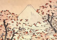
The Great Wave is the best known image of Japanese art in the Western world today, yet prints of it were sold in the 19th century. The Great Wave is part of one of the thirty six views of Mount Fuji.

Quote: “…of all I drew prior to the age of seventy there is truly nothing of great note. At the age of seventy-two I finally apprehended something of true quality...and at one hundred I shall have become truly marvellous, and at one hundred and ten, each dot, each line shall surely possess a life of its own. I only beg that others of sufficiently long life take care to note the truth of my words.”


Yayoi Kusama


Subject Matter:
From Kusama’s work, I can infer that she is trying to communicate her work through circles that may be acting like all the different planets. She could be portraying her obsession with certain shapes and colours. Critics have variously certified her work to minimalism, feminism, obsessivism, surrealism, pop and abstract expressionism. “One thing for certain is that it has been a long and strange journey for Kusama, who is 74 in 2004.”

Technique:
In Kusama’s work, she mostly does paintings, collages, sculptures and environmental works and they are all similar in the sense of sharing an obsession with repetition, pattern and build up. A lot of her work seems to be of smooth layers; some may be 3D and have bumps but mostly are not layered. Even so, she does have dramatic angles in her work that creates a sense of again, obsession.

Artist’s Career:
·        *Born in Matsumoto in 1929, Kusama remembers growing up “as an unwanted child of        unloving parents.”
·        * A penchant for drawing and painting led Kusama to plot her escape with the help of art    magazines, and after sewing black-market American currency into the seams of her clothes,  Kusama fled Japan in search of  her hero, Georgia O’Kleeffe.
·         * Kusama came to New York in 1958 and began to create a life for herself as an artist
·         * Kusama made the front page of the New York Daily News in August 1969, after infiltrating the   Museum of  Modern Art’s sculpture garden with a bunch of naked co-conspirations to perform   her “Grand Orgy to  Awaken the Dead.”

Links with own work:

I have really enjoyed researching about Yayoi Kusama as I love her style and her obsession with dots and circles on all her sculptures and paintings. I chose this artist because I want my final chair design to have that sense of abstract, repetition yet originality to it.

Tom Dixon


Subject Matter:
In my opinion, I think that the chairs that Tom Dixon has created are very simple and what interested me the most is the mood of the designs which seem to be very dark due to the choice of colour. The fact that he uses the colour black in the majority of his chairs which gives a bold effect to it.


Technique:

All of the chairs that I have viewed of his creations are very well sculptured as well as ergonomically friendly. I think that he did use  a range of tools to make these chairs look as they do: professional and well-constructed. The majority of his chairs are completely black. The reason behind this is not said however I think that it gives a sense of unity to his creations, and that it could be his signature on the chairs which shows that he as sculpted the chair.

Links with own work:
The reason why I have chosen this particular artist is because the majority of his chairs are black which got me thinking that I would like to have something similar on my chair to represent that it is designed by me. The artist also links into generating an idea similar to mine about making it ergonomically friendly as well as being well constructed. In addition, I would like to learn more about the sort of machinery and tools that Dixon has used to create some of these chairs so that I can incorporate these techniques when producing my final design. Personally, I would rather have a chair like Dixon’s rather than one which is too fancy looking and colourful and that is difficult to sit on as it is not ergonomically friendly.

Quote by Tom Dixon:
“The S-chair provided a step out of the self-production ghetto. The Jack Light proved a convincing attempt at mass-production.”

Frank Gehry

Frank Gehry was born in Toronto, Ontario, Canada  in 1929. He had studied at the university of southern California and Harvard, before he created his first practice, Frank Gehry and Associates in 1963. Soon after, this practice was succeeded by the firm Gehry & Krueger Inc. His deconstructed architectural style began to emerge in the late 1970s when he was directed by a personal vision of architecture. He created collages like buildings as well as the ah-hoc pieces of functional sculpture.The reason why I have chosen Frank Gehry as an artist to study is because the two main chairs that he has created look so simple yet perfect and that is what intrigued me.

The chair on the right is very well ergonomically designed, for example the end of the chair where the knees rest on has a curve instead of just a straight 90 degree cut. This makes the chair more comfortable for the person to sit on without having any strain or pain under the knees.

Another reason why it is well designed is because of the back support. It also has a slight curve for your lower back to fall into which would automatically give the person good posture as well as relaxing and simply just leaning back.


All of the reasons above also cover the chair design on the left. I personally think that this chair would be slightly more comfortable because of the curve on the top of the chair where your head can fall back and comfortably rest on.


Monday, 13 January 2014

Art Movements

Art Nouveau is a style of art that came into Europe during the late 19th century, though its influence is worldwide and continuous. The artistic style is characterized by the use of organic shapes and dramatic, curving lines that cover many forms of art including paintings, glassware, furniture, and architecture. Many of its themes are taken from nature, though accessible quite abstractly, and include plants, flowers, and naturally curved lines. A few famous artists for this style include Aubrey Beardsley, Thomas Malory, and Henri de Toulouse-Lautrec. This stylistic choice was ultimately changed in the twentieth century, but its influence can still be seen in Europe and other parts of the world.


Art Deco is a style of decorative art, design and architecture from the mid-1920s to the mid-40s in Europe, the United States and other countries. Art Deco was one of the first styles of modern architecture. It was influenced by different styles and movements of the early 20th century. An idea behind art deco architecture was to seemingly rationalise buildings the same way you would rationalise a car. The style was much more mutual in profitable buildings than in houses; many banks, schools, and libraries were built in this style. Most of the public buildings built by the Works during the Great Depression are in the Art Deco style. One of the most famous Art Deco buildings is the Chrysler Building in New York City, and another famous one is Bullock's Wilshire in Los Angeles


Bauhaus was a design school that appeared in Germany in 1919. Bauhaus designers and their students broke from tradition and established a very modernist style. Their main purpose was to incorporate art, technology and craftsmanship by disregarding standard and creating a new design philosophy. The original ideas varied from architecture to furniture design to typography. They believed that design of any sort should to be considered a high art as does painting or sculpture.