He was a German Architect who was broadly viewed as one of
the original masters of modern architecture. Mies, like many of his post WW1 generations,
pursued to form a new architectural style that could represent modern times
just as Classical and Gothic did for their own eras. He created an influential
Twentieth-Century architectural style, stated with extreme clarity and
simplicity. His mature buildings made use of modern materials such as
industrial steel and plate glass to define interior spaces. He strived toward architecture
with a minimal framework of structural order balanced against the implied
freedom of free-flowing open space. He called his buildings “skin and bones”
architecture. He pursued a balanced method that would guide the creative
process of architectural design, and is known for his use of the aphorisms “less
is more” and “God is in the details.”
Wednesday, 11 December 2013
Monday, 9 December 2013
Gerrit Rietveld
Reitveld (June 24 1888 – June 26 1964) was a Dutch Furniture
Designer and Architect. In 1911, he started his own furniture factory. He was
influenced by the ‘De Stjl’ movement (style, harmony & order). His work was
a reduction to the essentials of form & shape. He was a member of the
movement and Architect in 1919. Reitveld went through a lot of change during
his period: slavery, Industrial Revolution, WW1 and the Great Depression. He
used primary clours and simple basic shapes. In addition, he was also a product
designer such as designing lamps, and as a chair designer, he designed
rectilinear chairs. Also, Reitveld designed the ‘Zig-Zag’ chair in 1932 and
started the design of the Van Gogh Museum in Amsterdam.
Tuesday, 3 December 2013
Ergonomics
Ergonomics, which can also be referred to as human factors,
is the study of work and the science of fitting jobs to the people who work in
them. It is the science of designing equipment, the workplace and the job to
fit the worker. Ergonomic stress can be reduced by adapting the job to fit the
worker. Ergonomics specifically focus on the work environment and items such as
the function and design of work stations, displays, safety devices, controls
and tools to fit the employee’s physical requirements, limitations and
capabilities to ensure their well-being.
The data we collected in class helped us to find out the
average size of a human being. This research will help and allow us to make a
scale chair that would allow anyone in our class to fit comfortably into.
Ergonomics is important and humans need it in their life.
The reason for this is because humans come into contact with ergonomics on a
daily basis. Hence, it is a necessity. Ergonomics have five main principles
which are: aesthetics, comfort, ease of use, safety, productivity and
performance. These five principles can be broken down into three areas:
physical, cognitive and organisational ergonomics.
Physical Ergonomics: This is concerned with the way the body
interacts with the workers’ tool (such as personal computers and chairs) and
their effects on the body such as posture, layout of the workplace, repetitive
disorders and the health & safety of the workplace. Cognitive Ergonomics: This relates to
the way the mind practices data it is presented with and related motor
functions, memory usage and decision-making. Study of these aspects and the collaboration between
humans and the data presentation can improve everything from the location of
signs, the visibility and recognition of the data. Organisational Ergonomics:
This is concerned with improving the workplace, everything from cooperation to
measuring telecommuting and quality organisation.
Ergonomics
could be useful to an artist or a designer in many ways. As it comes into
everyday use which can be applied into the work of an artist to help them with
their ideas to further develop into final products. An artist or a designer must make sure products meet
the product specification, which should be directly influenced by the analysis
of research. This will certify quality of design and that the end product is
fit for purpose.
Furthermore, Frank and Lillian
Gilbreth expanded the field of ergonomics by expanding Taylor’s methods in the
early 1900’s to develop ‘Time and Motion Studies.’ They targeted to advance
effectiveness by removing pointless stages and actions.
Personally,
I would say that I see myself as being ergonomic as I come into contact with it
regularly, be it at home or outside of the home. Also, I try to take as much
care as I can when it comes to organisation and my surroundings.
Monday, 2 December 2013
Kara Walker
Kara
Walker, an African-American contemporary artist is most known for her black
cut-paper silhouettes in which she portrays race, identity, gender, sexuality
and violence. Kara Walker was born in 1969. Walker received a BFA from the
Atlanta College of Art and a MFA from the Rhode Island School of Design. Her
first exhibition was in Atlanta in 1991. A few years later, she became the
youngest–ever recipient of the ‘Genius Award’ (MacArthur Foundation Achievement
Award) at the age of 27 in 1997. Furthermore, Walker seems to have taken a
multiculturalist attitude in her private life, appreciating all people and accepting
diversity. In 1998, she was interviewed, and she recalled an incident where she
found a horrible note from the Ku Klux Klan after she took a walk in the [ark
with her white boyfriend John. Walker was frequently disliked for “hanging out”
with the white kids. Her romantic attraction to those she calls “white
boys” is thought-provoking in the way that it interprets as a recurrent theme
in her work.
Kara Walker Art Evaluation
Subject Matter and Technique:
In this piece of art work, Walker is
trying to portray a young girl who appears to be either surrounded by fire and
is trying to escape this dangerous situation, or she could have set the fire
herself with the can in her hand.
 Emotions play a key role in the
observation of art work; especially Walker’s art work as she purposely only
includes two bold contrast colours: black and white. This could be to convey
the emotion or feeling of horror, anger or jealousy in this particular image.
Jealousy is a predominantly interesting emotion that this picture could be
representing. For example, if this young girl did set the fire herself, then it
may be because of a tough time that she went through in her life which Walker
may be trying to express; and this tough time could involve hatred which mainly
leads to jealousy. Walker once said, “I’m not really about blackness, per se,
but about blackness and whiteness, and what they mean and how they interact
with one another and what power is all about.” From this quote, it could be
inferred that even though she completely separates the two colours, she is a
strong believer in equality and is trying to put emphasis and create an impact
that there should be a united power and no segregation.
In my copy of Walker’s art
work, I used black acrylic paint to create the silhouette effect, though I used
black chalk for the smoke to create that smoke looking effect as well as to
differentiate the result of this danger which is fire, and the aftermath which
is the smoke. In addition, the depth of this art work is flat yet bold from
close up as well as from a distance. This could be creating a sense that Walker
is trying to make a statement of a young innocent frightened girl up against
what could be her last breath as she is surrounded by fire. This statement
could be directly related to Walker herself as it may have occurred to her and
so she is expressing it through her art work.
Michael Craig-Martin Evaluation
Subject
Matter:
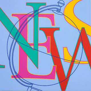
 This piece of art work is known as pop art as
the letters overlap each other with an outline of a globe on top of the
letters. The letters spell ‘NEWS’ and the globe on top of it represent
different news announcements that are heard every day around the world. It
could be suggested that the colours of the letters are all different as hot and
cold colours represent different types of news such as war in comparison to a
royal baby being born.
Technique:
Though Craig-Martin
overlaps the letters here, he is known for paintings which include no tone but
instead flat bold colours. The composition consists of straight neat lines for
the letters and an outline of a globe overlapping ‘NEWS’ which gives a short
and instant message. This art work has been painted using acrylics which I have
also used.
Artists
Career:
Michael
Craig Martin was born in Dublin (Ireland) in 1941 on 28th August and
died at the age of 71. He was born in the year in which Dublin was bombed as
well as during the World War II. Craig-Martin was educated in the United States
where he studied Fine Arts and Architecture at Yale University. From 1966, he
moved to England permanently to teach.
Links
with Own Work:
Personally, I
dislike Craig-Martin’s work as it doesn’t interest me instantly due to his
no-tone colours and neat lines. I prefer work with different uses of tones and
shapes rather than straight lines and flat use of colours. In addition, he uses
heavy and tame colours which are not appealing to the eye from my point of
view. However, one really interesting part of his work that does interest me is
the fact that he increases and decreases objects that wouldn’t be of that
scale, such as a safety pin is scaled much larger than a ladder as shown in the
picture below, which I have tried to replicate in my work in his style.
Subscribe to:
Comments (Atom)


